Chart with a single x-axis but two different ranges

Now let us try to create a simple graph from the same. A simple 2d column chart will look like this:

The issue with this chart is that the percentages are treated as decimals and have very low values r columns displayed which are not visible at all.
Let us handle it by creating the secondary axis as follows. Right click on the graph and click change chart type:

Select “Combo” chart type. Check secondary axis for percentages:

Right click the axis on the right and click format axis:

In the axis options change the min and max to 0 to 1.0

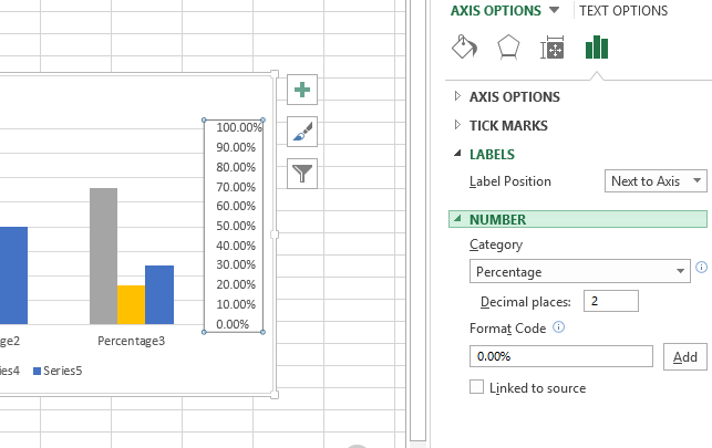
And then change the number format to percentages as follows:


Finally we will have 2 types of axis and the graph looks readable for both Density and percentages:

Template
You can download the Template here – Download
Further reading:
Basic concepts
Getting started with Excel
Cell References


