Min/Average/Max column Chart in Excel
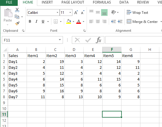
 Let us insert 3 rows for Max, Min And Avg Values:
Now we have to use formulas to calculate the Max, Min And Average as shown below:
- Max: =MAX(B5:B11)
- Min: =Min(B5:B11)
- Avg: =Average(B5:B11)


Now we have the Max, Min And Avg data for all items. Lets create the column chart now.
Select this data:

Create 2d column chart:

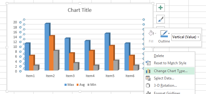
It will create the chart as shown below:

So for Each item we have the Max(blue), Min(grey) and Average(Orange) bars as shown.
We can also convert this to line chart if required as well. Right click on chart Area and select “change chart type”

Template
You can download the Template here – Download
Further reading:
Basic concepts
Getting started with Excel
Cell References


