How to make 4 Axis Graph
 Let’s analyze how well three sales men performed over the past four years with the help of a radar chart. Here, you need to represent the data in a 4 axis chart where each axis represents a year.
Create 4 Axis Chart
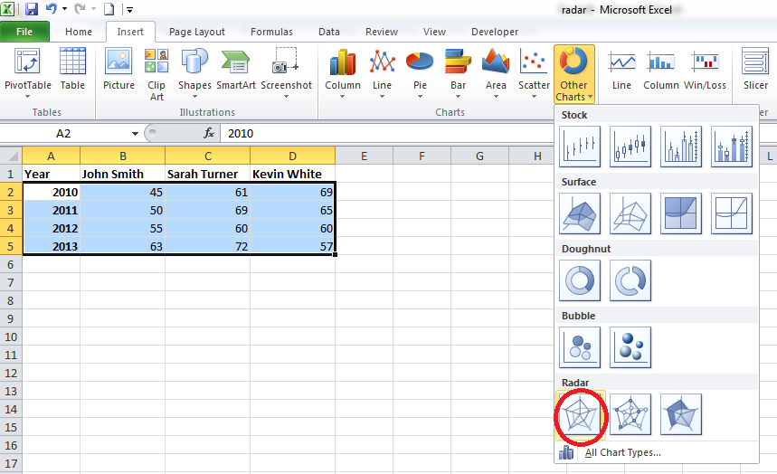
Step 1. Open Excel and save your file as radar.xlsx. Type “Year” in A1, “John Smith” in B1, “Sarah Turner” in C1, “Kevin White” in D1, “2010” in A2, “2011” in A3, “2012” in A4 and “2013” in A5.
You should not enter the double quotes when you type in the data. You can format these texts and make them bold. Again enter values less than 100 in cells from B2 to D5. These are the performance value of the sales men in percentage. Now your screen will look like this. Depending on the values you entered, the data in cell B2 to D5 could be different.

Step 2. Select cells from A2 to D5 and go to Insert (main menu) –> Other Charts (in the Charts group) and select the first chart type from the Radar section (circled in red).
Now your screen will look like this:
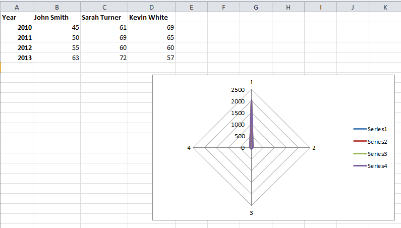
You can move the chart wherever you want by just dragging and dropping it. You will also see three new menu options (in the main menu) and they are Design, Layout and Format as in the following image.

Step 3. Select the chart by clicking somewhere inside the chart and go to Design (main menu) –> Select Data (in the Data group).

You will get a screen like this:
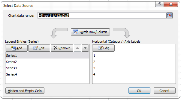
From the left hand side, select Series4 and click Remove. Then, select Series1 and click Edit and you will get a screen like this:

In the series name: textbox, enter “John Smith”. Click inside the Series values: textbox, delete the current value and select cells from B2 to B5 and now your Edit Series window will look like this:

Click OK. Now your Select Data Source window will look like this:

Select Series2 and click Edit. You will get the Edit Series window. Enter “Sarah Turner” in the Series name: textbox and select the cells C2 to C5 after clicking inside the Series values: textbox. Click OK. Again select Series3 and click Edit. Enter “Kevin White” in the Series name: textbox and select the cells D2 to D5 after clicking inside the Series values: textbox. Click OK. Now your screen will look like this:

Step 4. From the right hand side, click Edit. You will get a window like this:
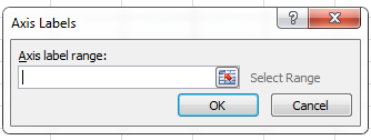
Click in the Axis label range: textbox and select cells from A2 to A5. Now your screen will look like this:
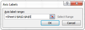
Click OK and you will get the Select Data Source window. Click OK. After making all the changes, your chart will look like this:
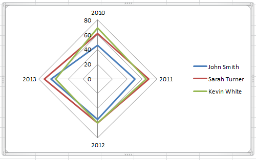
You can make lot many changes to the appearance of your 4-axis chart with the help of different menu options. For example, you can format the text, add minor gridlines, and so on.
Step 5. If you analyze the chart, you could understand many details easily. You can easily analyze the performance of each sales man for each year. You can also know who performed the best and who performed the least just looking at the 4 different axes. For example, the 2010 axes shows that Kevin White performed the best and John Smith performed the least. In the year 2013, Sarah Turner performed the best and Kevin White performed the least. Try changing the performance ratings and observe the difference in the chart.


